VOL. 42 | NO. 6 | Friday, February 9, 2018
Restaurants enhance the experience with luxury interiors
By Hollie Deese

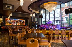
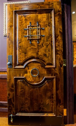
“We know what our concept is, but then we try to build it to fit the city that we’re in,” says Dillon Ruby, executive manager of Jeff Ruby’s Nashville Steakhouse. At right, this door at Jeff Ruby’s is made of knotty adler and leads guests into the speakeasy-themed Prohibition Room.
-- SubmittedDillon Ruby grew up around antiques and design just as much as he grew up around restaurants, thanks to two of his father Jeff Ruby’s most passionate interests.
“My dad antique shops all over the country, all year round,” Ruby says. “He’s always purchasing collectibles, even before he has a restaurant to put them in. We have a warehouse in Cincinnati that just holds all kinds of artifacts, all kinds of chandeliers. Just so many antiques.”
Dillon Ruby is the executive manager of the Nashville location of Jeff Ruby’s Steakhouse, and his father’s love for interiors and attention to special touches certainly finds its way into the expansive downtown space that has waiters scraping crumbs off white linens and escorting ladies to the restroom so there is no awkward searching.
“We had a great, fun time building this restaurant,” Ruby says of the 18-month buildout. “For us, it’s a design and it’s a concept that’s not trendy.”
Restauranteurs are increasingly investing in interiors. Intimate, romantic, even sexy, restaurant interiors become destinations for a great night out or special occasions such as Valentine’s Day.
Nashville designer Kathy Anderson says it has to do with the increased competition as patrons search for ways to stand out in a sea of excellence. She is the creative force behind the newly opened Black Rabbit downtown and the highly popular Sinema in Nashville’s Melrose neighborhood.
“If people are going to open a restaurant, design is important,” she points out. “They hire a good designer because they don’t want to mess it up or do it wrong. And so much money is spent, because the interior really helps make the business work.”
Architect Nick Dryden of Nashville’s DAAD agrees that a restaurant’s design is crucial in a competition atmosphere.
“In the last decade I think you’ve seen an explosion of that, and obviously a lot of that is due to the broadening of the food and beverage industry here, but I think people have just come to expect a pretty high level of execution of the interior design of these spaces,” he says.
Sure, it’s a chain, but …

This door at Jeff Ruby’s is made of knotty adler and leads guests into the speakeasy-themed Prohibition Room.
-- SubmittedJeff Ruby’s Nashville is one of four in the Cincinnati-based business’s roster, with the others in Louisville, Columbus and Cincinnati.
Each has a design concept that is consistent to the roots of the brand, a 1920s-1940s Art Deco concept, with crystal chandeliers and deluxe touches. The restaurant builds off that basic model based on the vibe of the city – and what’s available in the older Ruby’s warehouse of antiques.
“When he got that inspiration down in South Beach many years ago, that’s something that has stood through time, so it’s a concept that my dad’s really passionate about,” Ruby points out. “We know what our concept is, but then we try to build it to fit the city that we’re in. We have the Art Deco, the French Deco, the crystal chandeliers, but then we also have a lot of Nashville roots.
“We don’t want cookie-cutter restaurants. We don’t want every one being the exact same. We want to feel what the community is all about and try and incorporate a little bit of that into our concept, while staying true to our roots and what we’re really all about.”
Ruby adds the approach to design is important so the city and the community know that they’re not a huge franchise, but rather a family-owned, tight-knit group that wants to be different in each location.
“We don’t want you to come into the Nashville location, then go into our Louisville location and everything be the exact same,” he says.
Each room has something different too. One has Argentinian doors from the 1940s. Another houses Al Capone’s fireplace plucked out of his winter home in Florida. The Music City room has memorabilia all over the walls from different musical artists. A small, private speakeasy room – where you actually have to give a password for entry - houses all of the liquors.
“The table in there is an old Roman numeral clock face off of a cathedral in London,” Ruby explains. “Every room has something different and something really to wow you with.”
The ‘wow’ factor
Dryden knows all about the “wow” factor when it comes to restaurants too, and increasingly, his projects include local dining establishments as much as other commercial and residential projects. He uses local artists and makers as much as possible, creating a space that works with the neighborhood instead of against it.

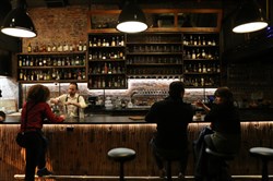
“Lighting is everything,” explains Nashville restaurant designer Kathy Anderson, whose latest space is Black Rabbit, shown here, on 3rd Avenue N. in downtown Nashville. Her previous work includes Sinema.
-- Michelle Morrow | The LedgerOne of his favorite projects that did just that was the original Burger Up in 12South, back when that neighborhood was evolving and finding its footing as a walkable community. The budget was small and the timeline was tight, but aspirations of the owners were high.
“It was a very small space, but for the neighborhood, we knew that was going to be a really important kind of outreach opportunity to say, ‘Hey, this really needs to be a place that’s envisioned for the neighborhood and for the community,’” Dryden says.
“We kind of rolled our sleeves up and designed all the furniture and actually fabricated all the furniture,’’ he adds. “We wanted that space to be really thoughtfully curated.
“And at that time in the market, there wasn’t really anything like that in Nashville. I think that having that kind of idea that there is no line between the design of the building, and then the design and execution of the interior restaurant space.”
Dryden even remembers thinking it wouldn’t even really matter if the food wasn’t that great, because the space was so beautiful people would still come. And they did, drawn to the successful bridge between commercial construction and execution of localized makers typically seen in residential projects up to that point.
“The craftsman-oriented stuff, we’ve done that a lot in the residential work that we do, but it never really entered the commercial market until we started doing that,” Dryden recalls. “And now you see it everywhere, you see it in restaurants, you see it in office spaces, and you see it in boutique retail spaces.
“All of those industries want to have a little bit more of a hand-crafted, almost domestic, residential, softer hand, softer touch.”
Creating intimacy with design
Many restaurant spaces start out as a huge, cold, open-air space. And that is why the design is so important when creating an atmosphere that calls for romance. Jeff Ruby’s for example, is close to 10,000 square feet, yet somehow exudes intimacy thanks to curved, wraparound booths and dim lighting. The result is more downtown Las Vegas than downtown Nashville.
“When you think of a typical steakhouse, it’s kind of stuffy, four walls and a ceiling, dark room,” Ruby says. “We wanted to provide a lot more energy, but at the same time we’ve got a lot of booths in the dining room that allow you to be intimate and close. Because it is so big, the design allows it to be more romantic. People feel like they’ve left the city for a little while and enjoyed not just dinner, but the full experience.”
Lighting and sound are two key components to creating that intimate atmosphere Ruby adds, which is why they have live piano at night to up the entertainment factor so people don’t feel they need to go anywhere else for the night.”
“Most restaurants are a destination, a stop you go to before a show or before you go to a concert,” Ruby continues. “For us, we try to do all that under one roof. It’s like dinner and the show all together.”
Dryden agrees that lighting and sound are some of the biggest influencers with creating intimacy in a vacuous spaces that most likely already has acoustical challenges by nature. But so do seating arrangement, furniture selection and materials. And how they all work together is what is going to drive the personality of the restaurant.
“Some restaurants work really well as lively, audibly loud spaces,” Dryden says. He cites Germantown’s City House as one such space. Raw, minimal, no art and with a centrally-located kitchen that booms with noise, it somehow works as one of the top spots people choose for special occasions.
“That restaurant is loud and active, and the kitchen’s out in the main dining room, and the acoustics are not great in there and the lights are bright, but I actually love that about that restaurant,” Dryden points out.
“You feel like you’re in this kind of super high-energy, active, urban space. That is so much about that experience and that brand, and you know that they are out there in the middle of the dining room, banging pots and pans together, and I think that that’s part of the whole show.”
One of the sexiest new spaces to open in Nashville in the last few months is Black Rabbit, a Printers Alley stunner designed by Anderson, who is no stranger to making restaurants sexy, like the dark and seductive Sinema in the Melrose neighborhood that was recently turned into a pulsating club on an episode of CMT’s Nashville.
For Anderson, the lighting has to be perfect in the spaces she designs in order to maintain any kind of intimacy. Same with the seating.
“Lighting is everything,” she says. “And I think when people go to restaurants, they’re wanting to go out and see people and be seen a little bit, but they’re not wanting their conversations to be shared with the people next to them. How you balance all that out is really, really important.”
And yes, restaurant interior designers do consider that people might be secretly wiping their fingers on the furniture when no one is looking, and choose materials that function under pressure, from slip-resistant tiles to how material will hold up to smells.
“Everything is commercial quality,” Anderson acknowledges. “We’re really careful about that. How will it be cleaned? How will it hold up with the abuse of people scooting in and out of the booth all of the time? How do you clean up food?”
If the look is done right, there won’t be the need to refresh it very often, and instead the design almost becomes what the restaurant is known for.
“I kind of pride myself on doing good, classic designs, and to me one of the biggest compliments is going back in a space years later and it still feels good,” she says. “So in reality you shouldn’t really have to remodel very often.”
As for where Anderson likes to go for her own romantic meals, Sinema is still her No. 1 choice, along with Henrietta Red, Park Café and Sea Salt, though now that she lives downtown herself, she loves Gray & Dudley inside the 21c Hotel, another new restaurant serving delicious fare and luxe interiors.
“It’s just a really great, intimate spot, not too noisy,” she adds.
Next up Anderson is working on the revamped Watermark space as it moves into the new Bridgestone corporate headquarters from its now-closed original Gulch location. She says to expect another jaw-dropping place to have a romantic meal.
“It’s going to be really dramatic, with 27-foot ceilings, just a soaring space.”